I want to make ME/CFS promotional and awareness banners for sites and social networks

Tally

Senior Member
Messages
367
Recently I've been learning about graphic design and picture editing software and even though I am still a complete beginner and not very good at it I would like to try and make something for ME/CFS so people can use it on their blogs or Facebook etc.

But I'm not sure where to start. What should I write on them? Is there some need for those for the May 12th?
Would you put those on Twitter or your Facebook if I put them in public domain?
 

redviper

Senior Member
Messages
145
Hey Tally,

I think this is an admirable offer and something that could benefit quite a few grass root ME advocacy organizations. The only problem is that a lot of the people running these groups (facebook ME support groups in particular) aren't on Phoenix Rising. May I suggest that you message the group adminstrators of CFS/ME groups on facebook directly and make this offer?, I'm sure you will find some are quite receptive. A quick glance at some of the current banners or cover pages for facebook ME/CFS advocacy groups shows some major groups with nothing ME related as their banner, and others that could certainly use an improvement.

Good luck!
 

Tally

Senior Member
Messages
367
Hey Tally,

May I suggest that you message the group adminstrators of CFS/ME groups on facebook directly and make this offer?, I'm sure you will find some are quite receptive.

This is quite a good idea. It doesn't have to be banners for Facebook pages but since I am quite ill at the moment (the moment being last 2 years :p ) I do need to take it slowly.
 

Tally

Senior Member
Messages
367
Why not do a few sample pix, @Tally?
I would love to but my brainfog is so bad right now I can't think of anything to write right now.

Maybe I should just try finding already existing ones and improving them? But I am worried someone will get offended.

Does ME have a ribbon color? Or a slogan that is comonly used?


Tally

Senior Member
Messages
367
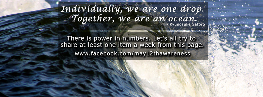
Ok, here is my first attempt:

vqZimsm.jpg


For May 12th Facebook page.

Their page said the wanted white text over the image of the ocean, but since I feel it gets too busy with a white text over complex image I used those black transparent rectangles. I get tired easily and this somehow makes it easier for me to read it.

I used calligraphy font for the top one because it's a quote, and bolded it because it's a powerful sentiment. The information below is in the more simple font, and smaller. I used Facebook's native font so it matches with the rest of the text that will get overlayed on the image.

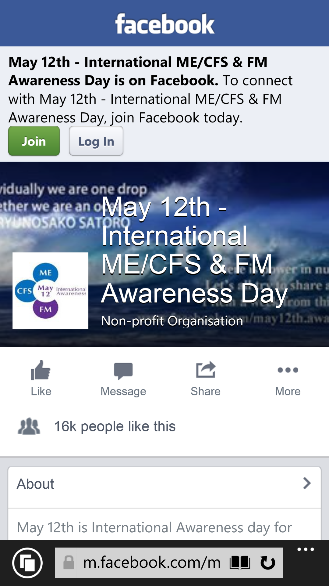
I had to squeeze everything in the middle because of Facebook's layout. The current layout they have gets cut off when you view it on mobile:

0t3C3c8.png


As you can see their text is cut off on the left and right, so I left those margins clear in my version.

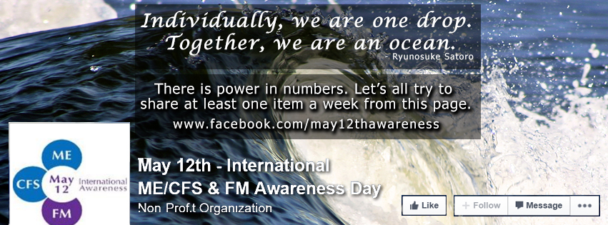
In the end, it should looks something like this on desktops, laptops and tablets:

bbqrupW.jpg


The ocean image I used has attribution licence, so we are free to use it as we wish as long as we attribute it to the author

Boelge stor, by Malene Thyssen, from Wikimedia Commons

Feel free to comment, criticize, and give suggestions. I can see it's far from perfect but it does seem like a slight improvement to me. What do you think?
 

redviper

Senior Member
Messages
145
Awesome @Tally , I commend you for achieving this so quickly. Personally, I think it's a huge improvement. You may want to subtly hint in your opening e-mail that mobile and tablet traffic consists of a large percentage of the total traffic on Facebook, so optimizing the banner for all platforms on Facebook is imperative. I'm sure if you point this out to the facebook admin they will be thrilled to incorporate your banner. The changes you made to the banner for mobile and tablet will result in a lot more people seeing the banner, which is a significant achievement. Great job making such a valuable contribution so quickly :)
 

WillowJ

คภภเє ɠรค๓թєl
Messages
4,940
Location
WA, USA
That is very nice! I like the black float thing. So cool that you are doing this.

Do you have a blog where you can post graphics? Here is a past one:
https://meaware.wordpress.com/
I don't know why Rachel isn't blogging now.
The purple ribbons are for fibro

For other things that aren't logos, usually the graphics are made two versions, one that says ME for people who don't want to use CFS at all, and one that says ME/CFS for people who worry about leaving behind those who are still getting diagnosed with CFS and would never know how to find the ME community without having their actual diagnosis listed.

Then there is SEID. (Although I have seen people using ME/SEID or SEID/CFS, but I wonder if 5 per graphic is not getting to be too much work.)
 
Last edited:

Tally

Senior Member
Messages
367
That is very nice! I like the black float thing. So cool that you are doing this.
Thank you! It feels great being at least a tiny bit useful again.

I changed the black to very dark blue to fit better with the ocean before I sent it. I think it looks even better that way :)

Do you have a blog where you can post graphics? Here is a past one:
https://meaware.wordpress.com/
I don't know why Rachel isn't blogging now.
The purple ribbons are for fibro

I don't have a blog. But I don't mind giving everything I make to others to post on their blogs. I don't even need any credit, I just feel like helping advocacy somehow and I am bedbound in a small European country, so not much I can do.

Thank for the info about the name use.
 
Back