• Welcome to Phoenix Rising!

    Created in 2008, Phoenix Rising is the largest and oldest forum dedicated to furthering the understanding of, and finding treatments for, complex chronic illnesses such as chronic fatigue syndrome (ME/CFS), fibromyalgia, long COVID, postural orthostatic tachycardia syndrome (POTS), mast cell activation syndrome (MCAS), and allied diseases.

    To become a member, simply click the Register button at the top right.

POLL: Which text format do you find easier to read with ME/CFS blurred vision?

Which text sample do you find easier to read, Text 1 or Text 2?


  • Total voters
    37

Hip

Senior Member
Messages
17,857
Many ME/CFS patients suffer from some degree of blurred vision. This blurred vision is not due to having the wrong prescription of glasses or contact lenses, but likely due to some ill health effects in the retina or eye lenses, or perhaps in the optic nerve or the visual processing areas of the brain. (There does not seem to be much research on this).

Blurred vision will often cause halos or starburst effects around bright lights at night, and may make it harder to read text on screen.


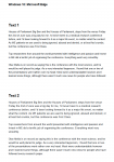
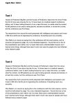
This poll is for all ME/CFS patients, whether you have blurred vision or not: it simply asks which of two samples of text you find easier to read: Text 1 or Text 2.

These two text samples can be found on THIS WEBPAGE.

The only difference between these two samples of text is the spacing between the letters: in Text 2 the letters are slightly more spaced apart compared to Text 1. So this is a poll to find out which letter spacing you find easier or more comfortable to read.

Please also post any relevant comments about the readability of these two text samples.

I'd be interested to know whether you found a noticeable difference in readability between Text 1 and Text 2, or if you found that there was very little difference.


If for any reason you cannot view the above webpage, the same text samples are also attached as images to this post. (As different computers will render the same text slightly differently, I have attached 3 screenshots of the text samples, as they look on Windows 10, Apple Mac and Android).
 

Attachments

  • Text Readability Test (Windows 10).png
    Text Readability Test (Windows 10).png
    116.1 KB · Views: 31
  • Text Readability Test (Apple Mac).png
    Text Readability Test (Apple Mac).png
    156.4 KB · Views: 35
  • Text Readability Test (Android).png
    Text Readability Test (Android).png
    245.8 KB · Views: 28
Last edited:

Diwi9

Administrator
Messages
1,780
Location
USA
Thanks for considering this, @Hip. I experience blurred vision (eyes have been checked and my vision and retinas are fine), looking at screens and reading can be difficult. My vision is most troublesome in the early mornings, late at night, or during a crash when I cannot tolerate the backlighting. I find using the black background option helpful too. Anyway, my vote is for Text 2...the difference in appearance is subtle, but the effect is great.
 

edawg81

Senior Member
Messages
142
Location
Upstate, NY
I have some blurred vision although very minor and usually temporary, but i can read both texts fine and have no preference, so i did not vote.
 

CreativeB

Senior Member
Messages
482
Location
Scotland
Hi. I have blurred vision when I'm feeling tired. I haven't voted as I struggled to read either very clearly, so didn't see a difference
 

lafarfelue

Senior Member
Messages
433
Location
Australia
I get occasional (ie. not constant, but regularly occurring) blurred vision due to fatigue (or whatever else ME/CFS reasons there may be), as all eye tests have come up fine.

My answer is maybe a bit odd (?) in that I think text sample 1 is easier to read when my brain is working a bit better, because of the clearer spacing between each word. It's easier for my brain to guesstimate what the words are/will be.

But when my vision AND my brain are completely out due to fatigue, text sample 2 would be easier to read... but by that point I don't know how much would sink in! :woot:
 

Moof

Senior Member
Messages
778
Location
UK
I have blurred vision, and Text 1 is hugely easier to read. It takes twice as long to read Version 2, so much so that it was a while before I even realised they were the same words. If I'd only had Version 2 available, I wouldn't have taken in the meaning properly because it's so incredibly difficult to follow that I was just skimming it.

The typeface in Version 1 appears sharp, whereas in Version 2 it looks like a low-resolution photo blurred by compression artefacts.
 

shannah

Senior Member
Messages
1,429
I have lots of visual problems including blurred vision that fluctuates in intensity depending on how ill I am on any given day. I also have processing problems which I'm sure must play a part in my reading difficulties. I usually am able only to briefly skim material. If I want to zero in on and digest what's being written, I often have to convert the text into Arial 12, 14 or larger.

I find the text in #1 easier to read as the spacing between the words is more clearly defined and it's easier to see the whole word. With #2, it all tends to run together a bit. I'm hunting for the start and end to the word in order to read the actual word itself. It not only takes much more work to do this but by the end of a sentence, I couldn't tell you a single word that I'd read.

I wonder if the results will vary depending on how long or severely ill people are.
 

Seven7

Seven
Messages
3,444
Location
USA
Interesting, I do not know what 1,2,4 are but It shows blurry to me. Even after I cast the vote. I do have POTs, and we are known to get pupil dilations issues so it might be it.,
 

Shoshana

Northern USA
Messages
6,035
Location
Northern USA
I have blurred vision difficulties nearly all the time, which are not from what the eye doctors can see, and which vary in intensity.
I find the dark backgrounds help me quite a bit.

The difference between the 2 types you showed, I did not find much difference but the #2 was just slightly easier than #1.

I would likely find other variations easier to read than either of those 2. Such as bolder print, and dark blue or grey backgrounds. And larger letters overall, I find most helpful. Thank for putting some focus on this problem, @Hip
 

Hip

Senior Member
Messages
17,857
I have blurred vision, and Text 1 is hugely easier to read. It takes twice as long to read Version 2, so much so that it was a while before I even realised they were the same words. If I'd only had Version 2 available, I wouldn't have taken in the meaning properly because it's so incredibly difficult to follow that I was just skimming it.

That's very interesting @Moof, that you say Text 1 is hugely easier to read, compared to Text 2.

That shows how important text styles are in terms of readability, and how sensitive us visually and neurologically-challenged ME/CFS patients actually are regarding text styles.

It also shows that ME/CFS patients are different in what text style suits them: I have blurred vision and ADHD, and find Text 2 easier to read than Text 1.


However, it's possible that by further tweaking the text style, you may find a style that works well for you: and to this end, I created a second webpage where you can adjust the text style to your own preferences just by moving some slider controls.

See here: TEXT STYLE PREFERENCE SLIDERS.

There are 4 sliders on that webpage, which control the letter spacing, word spacing, line spacing and text shade. Perhaps you might like to experiment with those slider controls, and let me know which slider settings you find result in the most readable text.

For me, I find the text is most readable with these slider settings:

Letter spacing = 5
Word spacing = 1
Line spacing = 3
Text shade = 3

With the sliders all set to zero, that corresponds to the default text style currently used on Phoenix Rising threads.


I find the text in #1 easier to read as the spacing between the words is more clearly defined and it's easier to see the whole word. With #2, it all tends to run together a bit. I'm hunting for the start and end to the word in order to read the actual word itself.

That's well articulated, thank you shannah.

Perhaps you might also like to play around with the TEXT STYLE PREFERENCE SLIDERS webpage. You can increase the spacing between words to suit by adjusting the slider controls.

So for example, you may find that you can increase the letter spacing for readability, but also at the same time increase the word spacing to ensure that the words remain distinct.

On that webpage, with the letter spacing slider set to 4, that corresponds to Text 2 in the poll test.

See which slider settings create the most readable text. Let me know which settings you like most.


With text #2 my brain was confused somewhat like what @shannah said where the letters ran together and I couldn't pick out the words as easily.

You can also try the TEXT STYLE PREFERENCE SLIDERS webpage, and increase the spacing between words by moving the slider control. See if more spacing between words helps.
 
Last edited:

alex3619

Senior Member
Messages
13,810
Location
Logan, Queensland, Australia
I haven't answered the poll yet, I hope to later. However let me point out that in sickle cell anemia there are retina problems, and the primary problem with that is low red blood cell deformability. The second problem is loss of blood cells leading to anemia ... we don't have that but we have OI and low blood volume.
 

Hip

Senior Member
Messages
17,857
However let me point out that in sickle cell anemia there are retina problems, and the primary problem with that is low red blood cell deformability.

That's interesting.

I've wondered whether the blurred vision of ME/CFS might be similar to the blurred vision that can result from protracted contact lens wear. Contact lenses impede the oxygen in the air from getting into the cornea (the front lens of the eye), especially the contact lenses that were used decades ago, which had less oxygen permeability than modern lenses.

Without its own blood vessels, the cornea must get its oxygen directly from the air. And when the cornea's oxygen supply from the air is reduced (hypoxia), this is known to lead to blurred vision and corneal swelling.

When I wore contact lenses decades ago, I was familiar with the blurred vision they would sometimes cause, especially if worn from morning to night, so that the cornea spends the whole day without any direct exposure to the air.


Anyway, how does this link to ME/CFS?

Well, since blockages in cellular energy metabolism and blockages mitochondrial functioning have been found in ME/CFS patients, these blockages may have a similar effect to a lack of oxygen in the cornea. Because in both cases, there is an energy shortage, since oxygen is used to supply cellular energy to the corneal tissues.

Thus because of these ME/CFS energy metabolism blockages (which we may assume occur in the cornea as well), the cornea in ME/CFS patients may be in a condition similar to starvation of oxygen. This presumed lack of a good energy supply to the cornea in ME/CFS patients therefore might be the cause of the ME/CFS blurred vision.
 

Hip

Senior Member
Messages
17,857
Here you are, @Moof, @shannah and @Judee: using the Text Style Preference Sliders webpage I created a text with both wider letter spacing and wider word spacing, shown here:

LS3 WS2.png

The above text is similar to Text 2, but with increased word spacing as well as increased letter spacing.

Does the increased word spacing improve things for you?


You can compare to the untouched text below (which is the same as Text 1):
LS0 WS0.png

The above uses standard (unaltered) word spacing and letter spacing.
 

Hip

Senior Member
Messages
17,857
I would likely find other variations easier to read than either of those 2. Such as bolder print, and dark blue or grey backgrounds. And larger letters overall, I find most helpful.

Would you have any examples of text on these dark blue or grey backgrounds that you can show, like websites using them?

Do you mean something like this perhaps:
LS2 WS2 LS1 Gray.png

The above uses Arial 16 px font size rather than the 15px used earlier.
 

alex3619

Senior Member
Messages
13,810
Location
Logan, Queensland, Australia
I have not answered the poll. I have blurred vision which I regard as ME related, but both texts look about the same for me. Contrast is what is most important to me, here I use a dark blue background with white text.
 

Hip

Senior Member
Messages
17,857
Contrast is what is most important to me, here I use a dark blue background with white text.

Do you use a browser extension or custom stylesheet to create the white text on a blue background? Is that how you read the PR forum? It would be nice to see a screenshot of this text if that's possible.

I use a custom stylesheet for PR, which changes the letter spacing, and also changes the font. I use the Gill Sans font, which was originally designed by Eric Gill for readability (it was created for use as a signage font). Unfortunately Gill Sans is not available on some computers.


I have blurred vision which I regard as ME related, but both texts look about the same for me

Interesting. For me, I find that my blurred vision blurs the outlines of the letters, and so adjacent letter tend to merge into an indistinct haze. I think that's why increasing the letter separation makes it easier for me to distinguish individual letters, which then increases readability.

But too much letter spacing is not good either; just a small increase in letter spacing is the optimum, I find. Too much letter spacing reduces readability.