• Welcome to Phoenix Rising!

    Created in 2008, Phoenix Rising is the largest and oldest forum dedicated to furthering the understanding of, and finding treatments for, complex chronic illnesses such as chronic fatigue syndrome (ME/CFS), fibromyalgia, long COVID, postural orthostatic tachycardia syndrome (POTS), mast cell activation syndrome (MCAS), and allied diseases.

    To become a member, simply click the Register button at the top right.

Infographics archive?

Messages
47
Location
UK
Is there an archive for infographics relating to M.E?


I would like to get involved in advocacy and I have graphic design experience. I’m interested in creating infographics which concisely summarise various aspects of M.E. (research, lack of funding, lack of awareness etc.) which can be shared on social media. I’m specifically talking about graphics that represent data and statistics (see examples below) as opposed to art work or cartoons. For instance showing how M.E. is at bottom of pile for funding by comparing money spent per person for other illnesses. Other examples could be clarifying and simplifying data produced from studies by Davis, Naviaux et al.


After a brief search through PR, Twitter and the #MEAction website I couldn’t find much. Surely there’s plenty of statistics, numbers and info that can be summarised into easy-to-understand graphics, or am I mistaken?


Thanks


JD


1560771_283350911815245_1209883274_n.jpg


1962831_287779111372425_1604521789_n.jpg


1613765_279636272186709_379936842_n.jpg
 
Messages
47
Location
UK
Worldwide; anything related to ME. Ideally they would be distributed through a central channel like #MEAction to maximise the reach. If there isn’t an archive then it would be a good idea to create one as a place to quickly grab and share, particularly during events like #MillionsMissing.

I helped design and coordinate a campaign on social media regarding the WCA and ATOS (in the UK) during 2013 and managed to reach 200,000 views in the space of a month, so would like to bring that experience to M.E. advocacy. We found summarising info from reputable sources into easily digestible graphics was a great way of gaining credibility and support.

Attached images are just examples to clarify type of Infographics I'm talking about.
 
Messages
47
Location
UK
Attached below is a design I've come up within the last couple of days. Below that are 2 examples of infographic designs that can be modified for ME info and statistics. I've also set up a Twitter account to archive the images: twitter.com/ME_infographics


So now the task is to find more relevant information and statistics. For instance the #MEAction website had some good general statistics for the USA like the following:


- Number of people with ME: 1 to 2.5 million


- At least 25% of ME/CFS patients are home- or bed-bound


- costs to economy: $17- $24 billion annually in lost productivity and direct medical costs.


- The Dimmock, Mirin & Jason comparison of funding for diseases with similar burden and prevalence


- Less than 12 clinics treat the millions of patients nationwide.


So if anybody can point me in the direction of some workable statistics that would be great! Thanks


JD


NIH-RCDC-Funding-2016-v1.png
infographic-banner-1.jpg
ie1-01-.jpg
 

Murph

:)
Messages
1,799
I'm a big fan of graphics - it's how I absobr informtion best - but I lack the aesthetic sense to make ones that really pop.

So I love this idea and am well aware that a few good infographics can spread well on social media and be really powerful.

Here you can find the data behind Naviaux's 2016 metabolomics study. http://metabolomicsworkbench.org/data/DRCCMetadata.php?Mode=Study&StudyID=ST000450

If you have any questions about the data just ask, but it shows big differences in ceramides, purines and sphingolipids which might be able to be summarised down to something simple. Here's a graph I made from data in that dataset. I know for sure you could make this a million times more expressive!

Screen Shot 2017-11-01 at 5.42.49 PM.png


I also think you might be able to show the potential of rituximab using this data from the last Fluge and MElla Rituximab study. Simply plotting the numbers in the last column would really show something.

journal.pone.0129898.t001(1).PNG


There's also the study that just came out about the miRNA levels after exercise. You can get their raw data here.

https://www.nature.com/articles/s41598-017-15383-9#Sec17

The data is a bit mixed. Depends on whether you're willing to wade thru and do analysis too!
 

Murph

:)
Messages
1,799
That's a nice graphic!!

I can't see the source for those exact numbers tho? When I look in table 2 and table 3 I find slightly higher numbers of abnormal pathways.
 
Messages
47
Location
UK
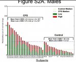
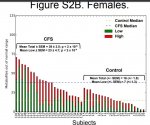
I came to those averages in a rather convoluted way, however after a second look at the data these two graphs (Fig S2A and S2B, from the appendix if I recall correctly) show a Mean Total of 40 for CFS across both sexes and likewise a Mean Total of 16 for the controls.

I don't understand what Mean Low represents. Is it a conservative calculation for the mean?

Naviaux pnas.1607571113.sapp Fig S2A Males.JPG Naviaux pnas.1607571113.sapp Fig S2B Females.JPG
 

Murph

:)
Messages
1,799
@JD_Lucas mean low refers to metabolites that were measured as being below the average for the group. (some metabolites came out high.

So on that graphic the average ccfspatient has 40 metabolites out of whack, 25 low, 15 high.

for the sake of a bigger relative difference plotting 25 low in patients vs 9 low in controls might give a more impressive graphic? Heading: metabolite shortfalls. It'd be justified because naviaux used the metabolite shortfalls to infer hypometabolism.
 
Messages
47
Location
UK
Thanks for clarifying @Murph. I can make 2 or 3 images over the coming weeks to show different aspects of the data. Obviously for this study it's about showing the empirical difference between ME/CFS and healthy controls. The graphic is nearly complete so it can easily be modified to suit whichever comparison that needs to be represented.

_Naviaux Humans PR Draft 2.png
 

Murph

:)
Messages
1,799
Nice one JD. Can I make a sugestion about the funding pile graphic above? I reckon a differnt template coudl be good. The left margin of the bar graph is obvisouly not meant to be part of the bars but the way it is coloured it looks like part of the bars. It means the total area occupied by the red line is not especially tiny and the effect is diminished. As you know people judge by looking at relative areas and the red area looks to be a third as much as MS, not a tenth
 
Messages
47
Location
UK
Yes, the funding graphic was a compromise. If I'd created the chart to scale then ME/CFS funding would barely be visible as its so small compared to the others. Thanks for the suggestion - making a graphic that shows the true scale between funding is an idea I want to play with in the future
 
Messages
47
Location
UK
Thanks @Joh, your link is exactly the kind of thing I'm looking for.

I have the PACE trial on my to-do list – as you say, I'm sure there's lots of important information that can be extracted.

In my experience the literature on ME/CFS can be confusing and daunting, however there's no doubt it can be simplified. Hopefully, health permitting, this is something I can work on as a continuing project and help spread awareness.

Thanks again to @Murph and yourself for helping me!
 
Messages
47
Location
UK
@Murph - I just had a play with the exact scale for the funding comparison. Here is what it looks like....ME/CFS is a tiny red dot in the middle, which may not be visible on your screen.

Circles - Draft.png
 
Messages
47
Location
UK
I'm now looking for the next idea for an infographic.

If you have some concise data/information to share then please let me know.

My initial thoughts are creating a graphic summarising information from either...

- Criticisms of the PACE trial

...or....

- Patients with ME score more poorly on quality of life surveys than patients with multiple sclerosis, stroke, diabetes, renal failure, lung disease, heart failure and various cancers. Source: http://journals.plos.org/plosone/article?id=10.1371/journal.pone.0132421
 
Messages
47
Location
UK
Would anyone like to help manage the ME infographics Twitter and Facebook accounts, as well as posting updates to forums?

I’d rather put my limited energy solely towards designing. If you’re interested let me know - it can be a group project so there can be more than 2 of us.